In this article
A line that slopes in the desired direction is an invitation to look more closely. It is not, by itself, proof that a particular intervention worked. A run chart preserves time order so readers can examine how a measure behaves across a sequence instead of reducing the story to two averages.
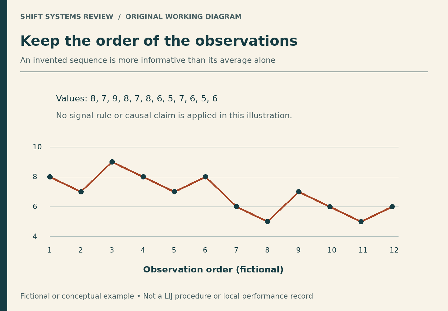
IHI’s Run Chart Tool page describes run charts as graphs of data over time that help assess patterns during improvement work. Its linked tools include instructions and templates. This article reviews basic chart reading; it does not reproduce the tools, teach formal pattern rules, or certify a statistical signal.
First read what a point represents
Fictional example: A chart shows the daily median completion time for generic office display-card sets. Each point is a daily summary, not one card set. Monday’s point may summarize twenty sets, while Friday’s summarizes four. Those values can be plotted together, but the different underlying counts matter.
The vertical axis must say minutes, hours, a percentage, or whatever is actually being measured. The label should also identify the summary: mean, median, maximum, or count. A chart titled “Completion time” leaves too much unstated. A line can be beautifully drawn and still be unclear about the evidence it represents.
Then read the horizontal axis
Are the points days, weeks, individual requests in order, or selected observations? A chart with twelve weekly points describes a different window from one with twelve requests completed in an hour. Equal visual spacing does not necessarily mean equal elapsed time.
Check for missing periods. If no data were available on Wednesday, joining Tuesday straight to Thursday can make the sequence look continuous. A gap should be explained, not filled with an invented zero. Zero minutes is a measured value with a meaning; “not observed” is a different condition.
Find the change without erasing the past
Imagine the fictional office tried an approved mock-layout template after week six. Mark that point. Also preserve known changes in the measure’s definition. If “finished” changed from “prepared” to “checked and ready” in week seven, a before-and-after comparison mixes two outcomes.
A chart may include a reference line, often a median from a stated baseline period. Read how it was chosen. Moving that line whenever the newest point arrives can obscure the comparison a reader thinks they are making. The reference period and any recalculation rule should be explained by the chart’s method.
Ask what would compete with the preferred explanation
Suppose the points fall after the template is introduced. That is consistent with a beneficial change, but other explanations remain possible. The work might have shifted toward simpler sets. A supplier might have provided pre-cut materials. The available observations might have changed. The measurement clock might have started later.
Annotations help readers investigate these possibilities. They do not establish causation merely by appearing beside a downward movement. Nor should an annotation accuse a person of causing a result. Keep the focus on verifiable process conditions and the limits of the evidence.
Do not improvise a signal rule
Visual impressions are vulnerable to scale, selective dates, and a dramatic last point. Formal run-chart interpretation uses defined rules; appropriate use requires knowing the chosen method and its assumptions. This introductory article deliberately does not attach a “proved improvement” label to a short invented sequence.
If a workplace chart carries that label, ask which method supports it, whether the definitions stayed consistent, and what evidence covers unintended effects. A graph does not override an immediate safety or privacy concern, which belongs in the established reporting route.
A five-question reading pass
- What exactly does each point summarize?
- Are time intervals, missing periods, and denominators visible?
- Did the definition or included work change?
- What events are annotated, and which explanations remain untested?
- What method supports the conclusion being stated?
Practice by drawing twelve invented values and labeling every assumption. Do not copy a workplace dashboard, export operational data, or record coworkers’ performance for this exercise. The skill is asking better questions of a chart, not creating an unofficial reporting system.
Scope: IHI’s public Run Chart Tool landing-page text was checked October 8, 2026. No gated download was submitted or represented as reviewed. The display-card case and chart-reading questions are original editorial material, with no claim about LIJ or Northwell outcomes.